If you've ever watched financial news after a Federal Reserve meeting, you've probably heard someone mention "the dot plot" with the kind of reverence usually reserved for ancient prophecy. Traders react. Markets move. Pundits dissect every shift like it's a treasure map to future wealth.
But here's the thing most people miss: the Fed's dot plot isn't a crystal ball. It's not even an official forecast. It's a quarterly snapshot of educated guesses from individual policymakers about where they think interest rates should go: and those guesses change constantly as new economic data rolls in.
Understanding what the dot plot actually shows, and more importantly what it doesn't, can help you make smarter long-term investment decisions without getting whipsawed by every quarterly release.
What You're Actually Looking At
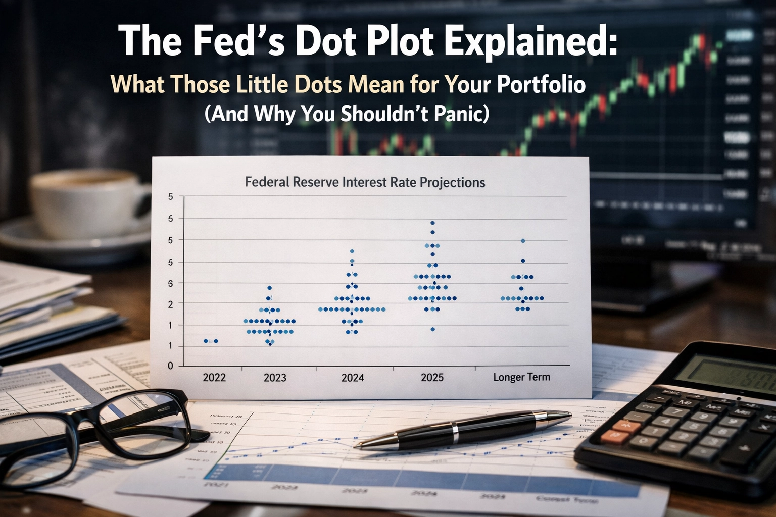
The dot plot is a quarterly chart where each Federal Reserve policymaker submits a single dot representing their projection for where the federal funds rate should be at the end of the current year, the next three years, and the longer run. Each dot represents one member of the Federal Reserve's policymaking committee, known as the FOMC (Federal Open Market Committee).
The chart itself is straightforward. The horizontal axis shows years ahead. The vertical axis shows the target federal funds rate as a percentage. The dots cluster around specific interest rate levels, revealing the range and consensus of Fed thinking at that particular moment.

The chart is published four times annually following the Fed's March, June, September, and December meetings. The most recent dot plot was released in December 2025, showing projections through 2028 plus a "longer run" estimate.
That "longer run" column deserves special attention. It estimates what policymakers consider a neutral interest rate: one that neither accelerates nor slows the economy. Think of it as the Fed's best guess at what a "normal" rate looks like when the economy is humming along at a sustainable pace.
A Brief History: Why the Dot Plot Exists
The Fed didn't always publish these individual projections. The dot plot was introduced in 2012 as part of the Federal Reserve's push toward greater transparency under Chairman Ben Bernanke. Before that, the Fed operated with more opacity, offering only vague statements about policy direction.
The logic was simple: if markets understood where policymakers were headed, it would reduce uncertainty and allow businesses and investors to plan more effectively. By showing the range of views among Fed members, the dot plot was meant to communicate that monetary policy isn't determined by a single voice but by a committee with diverse perspectives.
The intention was good. The execution has been messier.
Why Markets Care (But You Shouldn't Overreact)
The dot plot reshapes market expectations about future monetary policy. Even if the Fed holds rates steady today, a higher dot plot can push bond yields up and pressure stock valuations. This is because investors care more about what rates will be than what they currently are.
Here's why: asset prices today reflect discounted future cash flows. If the dot plot signals higher rates ahead, that changes the discount rate investors use to value stocks and bonds. Higher rates make future earnings less valuable in today's dollars, which can depress equity valuations: especially for growth stocks with profits far in the future.

Bond markets react even more directly. If the dot plot suggests rates will rise faster than previously expected, bond prices fall immediately to reflect the new outlook. Treasury yields adjust within minutes of the release.
As of December 2025, most projections clustered more tightly around 3%, suggesting greater agreement that rates would decline from the then-current 3.50%-3.75% range. That clustering matters because it signals consensus among policymakers about the economic trajectory.
But here's the critical caveat: the dot plot is not a guarantee. These are educated guesses that change as new economic data arrives. Fed members regularly shift their projections between quarterly releases based on inflation trends, employment data, and GDP growth. What looks like a firm commitment in March can be completely revised by June.
How to Read the Dots Without Losing Your Mind
The first rule of dot plot interpretation: look for clustering rather than individual dots. When most dots cluster tightly together, it signals agreement among policymakers about future rate direction. Scattered dots indicate disagreement and uncertainty: which is normal and doesn't require immediate action on your part.
Markets focus primarily on the median dot and overall trend, not every individual projection. The median represents the middle estimate when all dots are arranged from lowest to highest. This single data point often drives headlines because it approximates the committee's consensus view.
Compare dot plots over time to identify trends. A shift higher suggests the Fed is leaning hawkish, meaning policymakers are more concerned about inflation and willing to keep rates elevated. A shift lower indicates a more dovish stance, suggesting concerns about economic weakness and willingness to cut rates to support growth.

Pay attention to the range as well as the median. A wide range of dots means significant disagreement among Fed members about the economic outlook. This uncertainty often translates to market volatility because investors don't have clear guidance about policy direction.
The "longer run" dots also matter. They reveal how Fed members view the economy's structural conditions: what they believe the neutral rate should be once temporary shocks fade. If longer-run dots have shifted higher over several quarters, it suggests the Fed believes the economy has changed in ways that require permanently higher rates.
What the Dots Don't Tell You
The dot plot doesn't explain the reasoning behind individual projections. You don't know which Fed member submitted which dot or why they chose that particular level. Regional Fed presidents often have different economic perspectives than Board governors in Washington, but the dot plot treats all views equally.
The projections also don't account for unexpected shocks. A banking crisis, geopolitical event, or sudden inflation surge can render the entire dot plot obsolete within weeks. Fed members themselves acknowledge this uncertainty, which is precisely why they publish individual projections rather than claiming to know the future with certainty.
The dot plot also doesn't tell you what the Fed will actually do. It shows what individual members think the Fed should do based on their current economic outlook. Policy decisions require majority votes, and those votes happen meeting by meeting as new data arrives.
The Bottom Line for Your Portfolio
Use the dot plot as a context tool, not a trading signal. It helps you understand the Fed's current thinking about the economy's health and the likely policy direction over the next few years. This can inform long-term investment decisions about asset allocation and valuations, but individual dot plot releases shouldn't trigger portfolio panic.
If you're a long-term investor focused on building wealth over decades, quarterly shifts in the dot plot matter far less than your overall investment strategy. A portfolio built around diversified assets, reasonable valuations, and your specific financial goals can weather whatever path interest rates actually take.
For investors interested in how broader economic trends shape specific sectors, understanding monetary policy context helps evaluate opportunities in areas like AI stocks positioned for long-term growth, which may react differently to rate changes than traditional value stocks.
The dot plot is most useful when combined with other Fed communications: the policy statement, the press conference, meeting minutes, and speeches by individual members. Together, these sources paint a fuller picture of the Fed's assessment and intentions.
Remember that even Fed members get it wrong regularly. Economic forecasting is notoriously difficult, and the dot plot's track record is imperfect at best. The Fed has consistently revised projections as conditions changed, sometimes dramatically.
The key insight: the dot plot shows you where policymakers think they're going, not where they'll actually end up. Treat it as one data point among many in your investment research, not as gospel truth about the future. Markets will overreact. You don't have to.