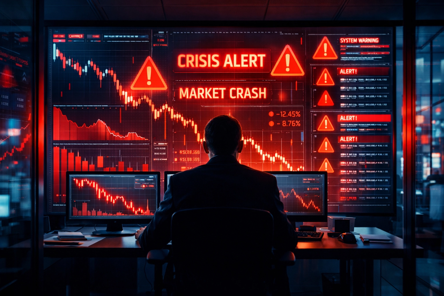
Market crashes don't happen in a vacuum. Despite the chaos and panic that define these events, most major downturns follow identifiable patterns: clusters of warning signals that precede the collapse by months or even years. The challenge isn't identifying a single "magic indicator" that predicts every crash. Instead, successful investors learn to recognize when multiple red flags align, creating conditions ripe for a significant correction.
Understanding these warning signs provides retail investors with a defensive toolkit: a framework for recognizing when markets have stretched too far and when it's time to reassess portfolio risk.
The Five-Stage Pattern of Market Crashes
Historical analysis reveals that market crashes typically follow a predictable progression through five distinct stages. Recognizing where markets sit within this cycle offers crucial context for interpreting individual warning signals.
Stage One: Credit Explosion. The cycle begins with rapid expansion of credit across the financial system. Low interest rates and loose lending standards fuel borrowing by consumers, corporations, and governments. This credit surge creates the fuel for asset price appreciation.
Stage Two: Concentration Trap. As the bull market matures, gains become increasingly concentrated in specific sectors or a handful of high-flying stocks. Broad market participation narrows, with a small number of companies driving the majority of index returns.
Stage Three: Smart Money Exit. Corporate insiders and institutional investors begin reducing positions, even as the broader market continues climbing. This persistent selling by experienced market participants occurs quietly, often months before retail investors recognize trouble.

Stage Four: Liquidity Illusion. Markets appear stable and liquid on the surface, with low volatility readings creating a false sense of security. This calm precedes the storm, as liquidity can evaporate rapidly once stress emerges.
Stage Five: Trigger Event. An economic shock: a policy shift, geopolitical crisis, or corporate failure: ignites the decline. This trigger exposes the vulnerabilities built during earlier stages, converting a stretched market into a falling one.
The Yield Curve Inversion: The Classic Warning Shot
Among economic indicators, the yield curve inversion stands out for its reliability in forecasting recessions and market downturns. This signal occurs when short-term Treasury rates exceed long-term rates: an unusual situation that reflects bond market expectations of economic trouble ahead.
Under normal conditions, investors demand higher yields for lending money over longer periods, creating an upward-sloping yield curve. When the curve inverts, it signals that bond investors expect the Federal Reserve to cut rates in response to economic weakness. Historically, yield curve inversions have preceded every U.S. recession since 1955, with stock market corrections typically following within 12 to 24 months.
The predictive power comes from what the inversion reveals about credit conditions. When short-term borrowing costs exceed long-term rates, banks face reduced profitability on lending, which tightens credit availability across the economy. This credit contraction slows economic growth and corporate earnings, eventually pressuring stock valuations.
For retail investors, tracking the spread between 10-year and 2-year Treasury yields provides a straightforward method for monitoring this indicator. When the spread turns negative and remains inverted for an extended period, it's time to review portfolio positioning and ensure adequate diversification.
Warren Buffett's Favorite Indicator: Market Cap-to-GDP
Warren Buffett has called the ratio of total market capitalization to GDP "probably the best single measure of where valuations stand at any given moment." This indicator compares the aggregate value of all publicly traded stocks to the size of the economy they represent.
The logic is straightforward: over long periods, corporate earnings grow roughly in line with economic output. When stock market valuations significantly outpace GDP growth, it suggests investors are paying excessive prices relative to underlying economic fundamentals.
Historically, readings above 100% have indicated overvaluation, while readings below 75% have signaled attractive entry points. The indicator reached extreme levels before both the 2000 dot-com crash and the 2008 financial crisis. In early 2000, the ratio exceeded 140% before technology stocks collapsed. In 2008, it approached 110% before the housing crisis triggered the market decline.
The Market Cap-to-GDP ratio doesn't provide precise timing for market turns, but it effectively identifies when long-term risk-reward dynamics have become unfavorable. When the indicator reaches elevated levels, it signals that forward returns are likely to be below average, even if markets continue climbing in the near term.
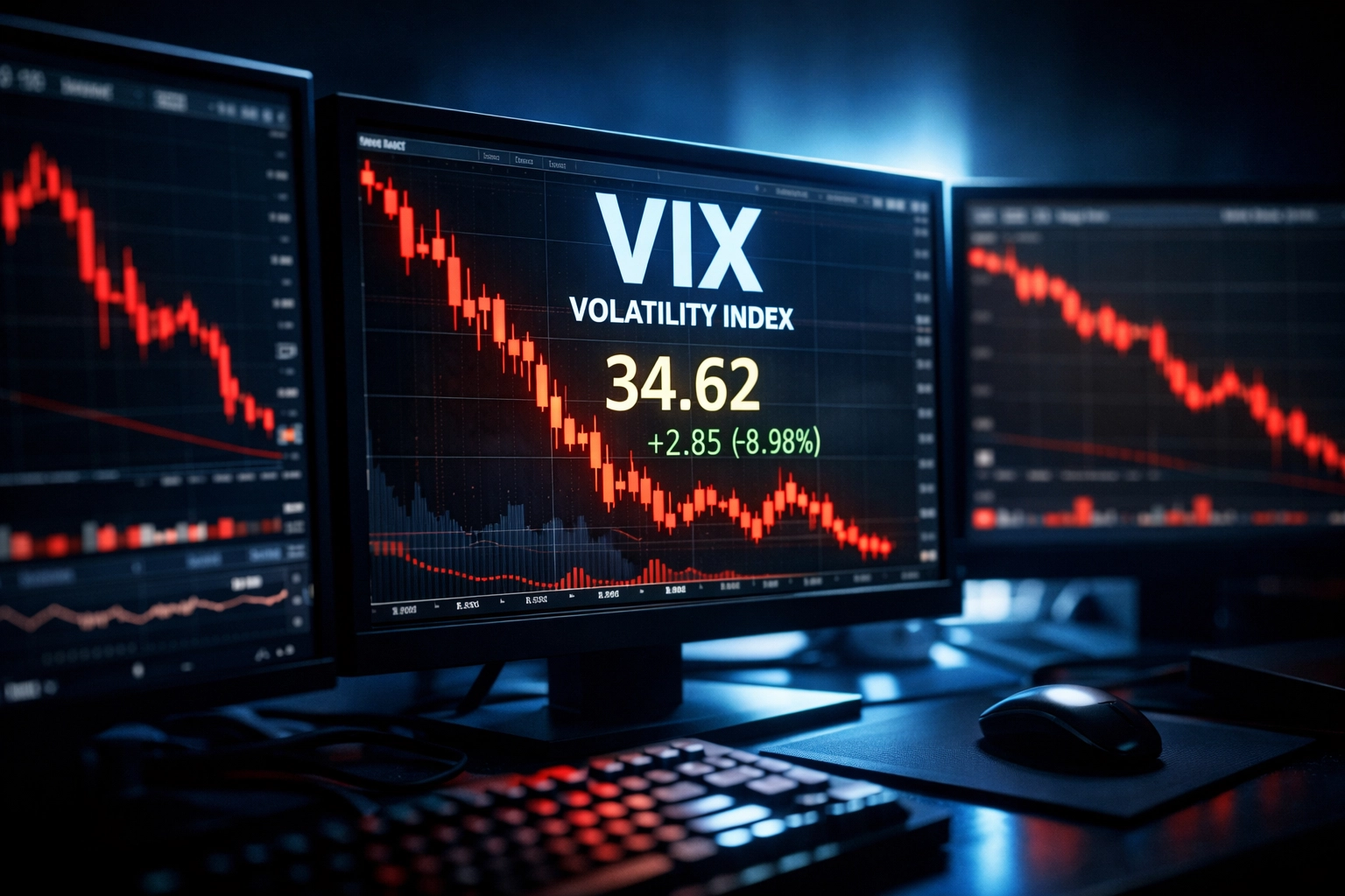
The VIX: Reading the Fear Gauge Correctly
The CBOE Volatility Index, commonly known as the VIX, measures expected market volatility based on S&P 500 options pricing. Often called the "fear gauge," the VIX spikes during periods of market stress and declines when investors feel confident.
The counterintuitive warning signal comes not from high VIX readings but from extremely low ones. When the VIX falls below 12 for extended periods, it indicates market complacency: investors have become too comfortable, pricing minimal risk into their positions. This complacency leaves markets vulnerable to sharp reversals when unexpected events occur.
Major market crashes frequently follow periods of abnormally low volatility. The VIX spent much of 2017 below 12 before surging to 37 during the February 2018 correction. Similarly, volatility remained subdued in early 2020 before exploding to 82 during the COVID-19 crash.
Rising VIX levels don't necessarily predict crashes, as volatility can spike during normal market corrections. The warning comes when prolonged low volatility combines with other risk factors like elevated valuations or economic deterioration. This combination suggests investors have grown too relaxed about risks that remain present beneath the surface.
Overextended Tech Sector Valuations
Technology stocks have driven market returns for the past decade, but extreme concentration in this sector creates vulnerability. When a small number of high-multiple tech companies account for the majority of index gains, it indicates a narrow market susceptible to sharp reversals.

The warning signs appear in valuation metrics like price-to-earnings ratios and price-to-sales multiples. When these ratios for technology stocks stretch significantly above historical averages: and above the rest of the market: it suggests investors are extrapolating recent growth trends indefinitely into the future.
History shows that periods of extreme sector concentration typically end badly. The "Nifty Fifty" bubble of the early 1970s saw a handful of large-cap growth stocks dominate before collapsing. The 2000 technology bubble similarly featured extreme valuations in internet and telecommunications stocks before a 78% decline in the NASDAQ.
Monitoring sector weights within major indices provides insight into concentration risk. When the top 10 stocks account for more than 25% of the S&P 500's market cap, or when technology sector weights exceed 25%, it indicates elevated concentration that could amplify declines during a correction.
Investor Sentiment: The Danger of Extreme Greed
Market tops typically feature extreme bullish sentiment: a point where nearly everyone expects continued gains, leaving few potential buyers to drive prices higher. This sentiment manifests in multiple ways: record margin debt levels, surging retail brokerage account openings, and overwhelming optimism in investor surveys.
The American Association of Individual Investors (AAII) conducts weekly sentiment surveys that track bullish and bearish percentages among retail investors. When bullish sentiment exceeds 50% while bearish sentiment drops below 20%, it signals excessive optimism. These extremes have marked market tops with notable consistency.
Social media and financial news coverage amplify sentiment extremes in the modern market. When investment discussions dominate mainstream conversation and speculative assets attract widespread attention, it indicates late-stage participation. Retail investors typically enter markets heavily near the end of bull runs, just as professional investors reduce exposure.
Rising margin debt: money borrowed to purchase stocks: provides a quantifiable measure of sentiment extremes. Margin debt levels tend to peak several months before major market tops, as aggressive investors maximize leverage to chase returns. When margin debt reaches new highs relative to market capitalization, it signals both excessive optimism and increased systematic risk.
Why Clusters Matter More Than Individual Signals
No single indicator predicts crashes with perfect accuracy. The 2020 COVID crash occurred despite relatively normal readings on many traditional warning signals. Conversely, markets can remain overvalued or see inverted yield curves for extended periods without crashing.
The strongest early warnings emerge when multiple signals move in the same direction simultaneously. Rapid credit expansion combined with persistent insider selling, rising policy rates alongside shrinking central bank balance sheets, and liquidity stress in Treasury markets create conditions where crashes become probable rather than possible.
Investors should monitor indicators across multiple categories: valuation metrics, economic conditions, market structure signals, behavioral sentiment, and structural vulnerabilities. When three or more categories flash warning signs concurrently, it indicates elevated risk that justifies defensive positioning.
Building Your Defensive Toolkit
Understanding market crash anatomy doesn't mean perfectly timing exits or predicting exact tops. Instead, it provides a framework for recognizing when risk-reward dynamics have deteriorated and when defensive measures become prudent.
Practical steps include: tracking the yield curve spread through Federal Reserve data, monitoring the Buffett Indicator quarterly, setting alerts for VIX levels below 12 or above 30, reviewing sector concentration in your portfolio monthly, and following sentiment surveys like the AAII index.
When multiple warning signs align, consider reducing portfolio leverage, increasing cash positions, rebalancing away from overweighted sectors, and reviewing the quality of holdings. These defensive adjustments don't require selling everything: they simply acknowledge that when risks rise, portfolio positioning should adapt accordingly.
Markets crash when vulnerabilities meet catalysts. By recognizing the warning signs before everyone else, investors gain the time and perspective to protect capital and position for the opportunities that emerge after the storm passes.